Mendix Chart Tooltip Formatting
Recently our Mendix programmers added some charts to a new page. They wanted the number in the tooltip to have comma thousands separators and no decimal spaces. But we hadn't really messed with the custom formatting on charts yet. I was asked to do some research on the subject.
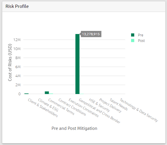
They were using the Column Chart widget and by default the tooltip displayed as one big number with no separators on a white background. Like this:
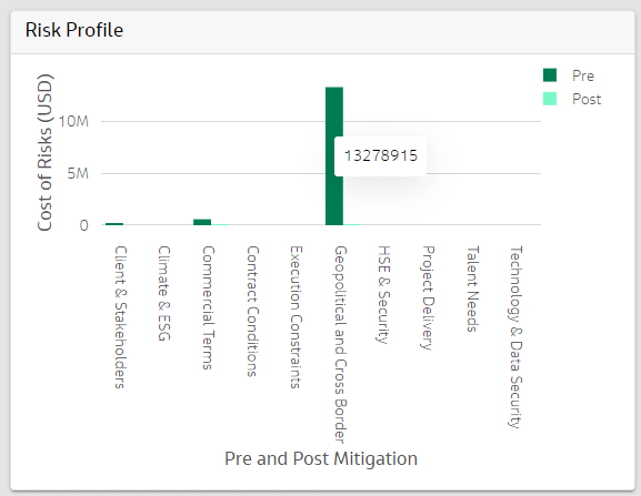
So I double clicked the widget and went to the Advanced tab to turn on the Developer Mode. Then saved the page and hit F5 to rerun the application. Now when the page reloaded there was a Toggle Editor button that could be pushed to see what the default setting were on the chart.
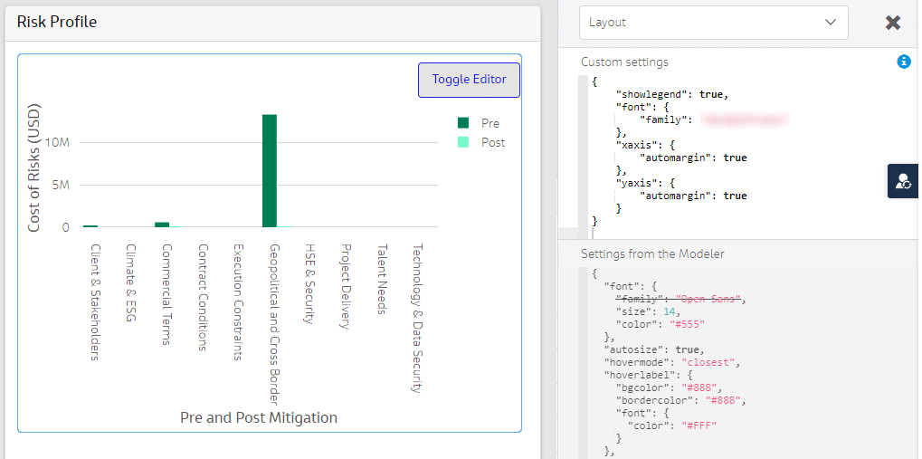
It appeared there were hover label defaults with background, border and font colors. But these were not being used at all.
Next I dived into the Plotly chart documentation about hoverlabels. But this was all kind of geared towards Phython programmers and wasn't helpful at all. One thing that was mentioned on the page was the concept of hovertemplates. So next I tried Googling several combinations of "Mendix chart tooltip hovertemplate" and surprisingly came back with a Mendix forum post on the subject. The first answer recommended creating a hovertemplate with this format.

Now the forum post wasn't trying to format the tooltip exactly like I wanted it to be. But they did show me the format that Mendix needed and also linked to a Github URL about d3 formatting. Next I had to do some research on d3 formatting before I fully grokked the syntax.
{
"hovertemplate": "%{y:,f} <extra></extra>"
}
Now I just need to figure out where to put the template.
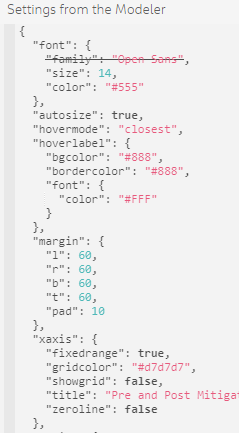
I tried it at the same level as the hoverlabel and then under the xaxis. Neither worked at all. Then I noticed the dropdown at the top of the editor.
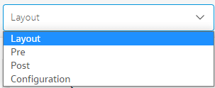
The Pre and the Post are the xaxis and yaxis that is configured for the the column chart widget. When I added my hover templage under the Pre dropdown, low and behold I had a new tooltip formatted correctly. Well sort of...
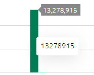
Now I had two tooltips displaying. One that had the original white background that had no formatting and another that was formatted correctly using the hovellabel formatting. So I needed to figure out how to get rid of the second label.
I'm not going to bore you with all of the hoops I had to jump through to figure out how to do that. Here is what finally worked.
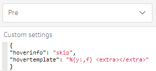
Now that it is working in the Developer Editor. Where do I add this in the widget configuration? It ended up not being too had to figure out. Double click on the chart widget in Mendix Studio Pro. Under the Chart Properties tab, double click on the correct Series.
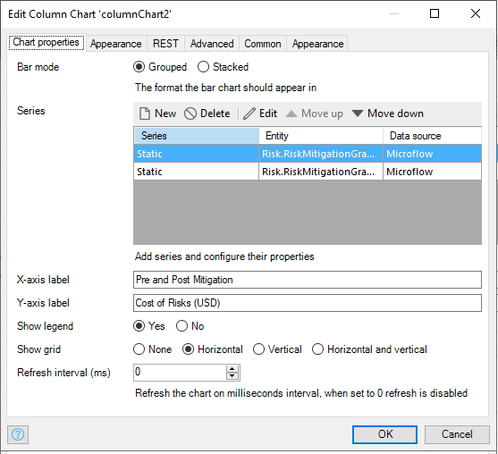
Click on the Advanced tab and add the hoverinfo and hovertemplate.
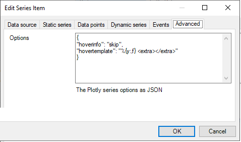
Now when you save the page and rerun the application yo will have a properly formatted chart tooltip on your Mendix page.
Leave a Reply
All comments are moderated. I'm in charge and if I don't like your comment, it just won't appear on the site. Be nice to me and others. Be constructive. Be helpful.