Mendix SCSS Structure
If you are like me, I work for a Fortune 500 company who recently choose the Mendix platform to develop some critical applications. We have 10-20 programmers working on way too much functionality. With only one UI developer trying to control the CSS that controls the look and feel for the whole site. Unfortunately most programmers don't have a high level knowledge of CSS. Which means they create a lot of redundant CSS and way more files than necessary.
So I like to set up a structure that is easy to navigate and maintain. I base it loosely off of Sass Guideline's suggested 7-1 pattern. Where you have seven folders and then one file at the root level to import all of your individual files from the folders.
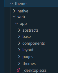
Start in the /theme/web/app/ folder. Create the below folders:
- base - This folder contains the top level items. Like _reset, _typography, etc.
- components - This folder is for individual components like _buttons, _datagrid, _listview, etc.
- layout - This folder is where I add layout files like _header, _footer, and some css grid/flexbox files. More on that in another post.
- pages - This folder is for page specific files. Like _home, _faq, etc.
- themes - This folder is for theme specific files. Like _colors, _darkmode.
- abstracts - This folder is for tools and helpers. Like _variables, _mixins, etc.
- vendors - This folder is for third party files. Like _bootstrap, _normalize, etc. Honestly I often don't use this folder. To me if I am overriding the Bootstrap button CSS, I usually do it in the components/_buttons file.
From there I create a file outside the folders in the root of the /app/ folder called _desktop.scss.
The ending folder structure would look like this (notice no vendor folder):

nside my _desktop.scss file I'll import the individual .scss files from the folder structure and add comments to keep it nice and neat. Here is a screen shot of the top of the file.

Mendix Mobile SCSS
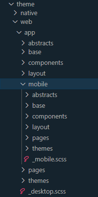
If you plan to do different page for a mobile view of your site, then create the exact same folder structure inside of a mobile folder. This way you can isolate the SCSS that is only being used for phones. Then create a _mobile.scss file at the root of that folder. Like the image below.

Mendix main.scss
Once the basic folder structures are set up to handle the .scss files, I'll import them into the main.scss file.

Desktop and Mobile SCSS File Prefix
From there all files created inside of these folders have a prefix of "_dt-" for the desktop files or "_mob" for the mobile files. Since Mendix uses the Bootstrap library and the Atlas UI framework, there are many SCSS files that show up in the list of files when you inspect an item in the browser. The prefix makes it easy to see how your SCSS files impact the item.

Mobile SCSS Isolation
To keep the mobile SCSS from interfering with your desktop styles, I found it is best to create a simple nesting structure inside of every mobile .scss file. Mendix adds a .profile-phone class to the body tag when it detects mobile devices on load. So enclose all of your SCSS inside of your files with that class like below.

Leave a Reply
All comments are moderated. I'm in charge and if I don't like your comment, it just won't appear on the site. Be nice to me and others. Be constructive. Be helpful.