Replacing WordPress with Next.js - Part 2 Design
Before coding I always think it is important to spend some time designing what you want the final site to look like. I liked my past WordPress theme. So I want to base the new site loosely after that look. But I also want to make some subtle changes that were not possible with the theme I had.
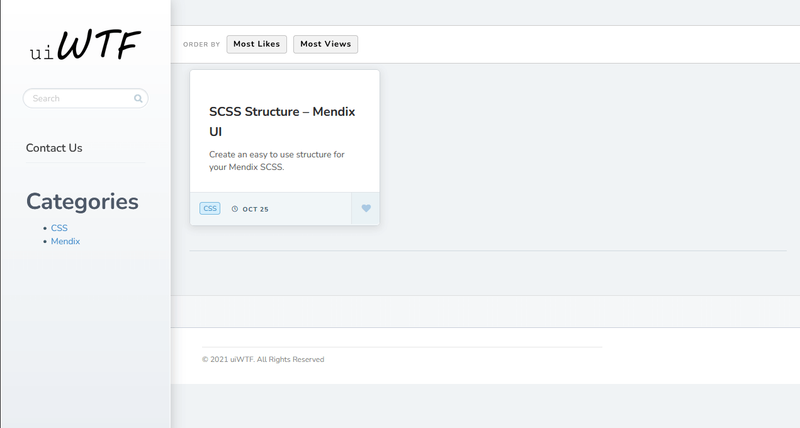
Here is the original theme.

It is a pretty minimal design. But I want to change the navigation a little. I'd like a fixed header with my static page navigation on that. I don't want the "like" option. I don't care about sorting by "most likes" and "most views". So I will remove that.
I'll use Figma to work out some different looks and decide on colors. Then convert it all to a Tailwind CSS layout. Here is the Figma uiWTF URL so that you can see the individual pages and colors.
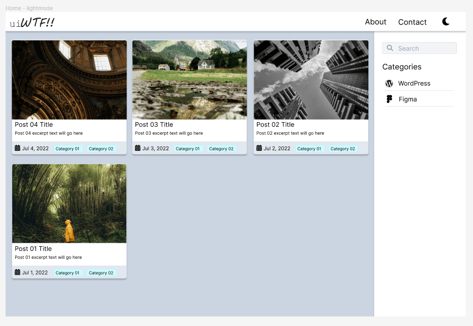
This is what I'm planning the home page to look like.

It will have a fixed header for the navigation structure. Then a right column where search and category navigation will go. The left side will have cards with blog posts listed.
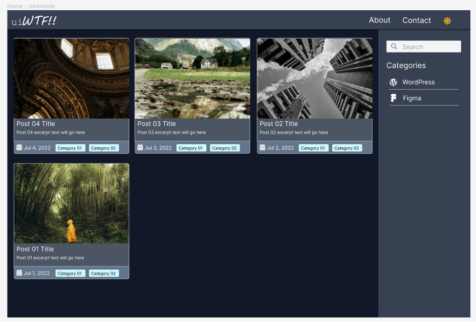
I'll also have a darkmode version of the home page. The toggle to switch between lightmode/darkmode will be on the right side of the top header.

Leave a Reply
All comments are moderated. I'm in charge and if I don't like your comment, it just won't appear on the site. Be nice to me and others. Be constructive. Be helpful.